|
|
|
TEN YEARS OF TOUR CLIMBS - WHAT'S CHANGED ? For several years, the website Danskebjerge.dk has gathered data about the categorized climbs of the different editions of the Tour de France. Now, in 2016, the data have a time span of ten years, providing a still more solid ground for an analysis of the climbs and the changes they have undergone. There are basically two purposes of the survey. The first is to define the various categories. There are no official description of them, so we need to look at their lengths, slopes and number of occurrences in order to understand what they represent. Secondly, the survey makes some comparisons between different editions of the Tour de France. This can help underline specific characteristics of a Tour, and also highlight how the climbs change over time - because they do change. The analysis is based on the data provided by the organizers prior to the race. Thus, eventual route changes will not influence the results. The basics But let's now turn to the overall properties of the categories. There are five categories, ranging from the hardest, which is the HC category, to the easiest - Category 4. In general, you would expect the hardest category of climbs to have the biggest lengths and slopes and the easiest to have the smallest ones. The data, however, partially confirms this assumption, as this overview shows:
The table is based on data from all categorized climbs of the five Tours from 2012 to 2016. There are 302 climbs in total, and what you see in bold numbers, is their average values. Thus, the length of all HC category climbs of 2012-2016 is 16.1 kilometres in average, the average grade is 7.4 in average (yes, it's an average of an average!), and the frequency is 6.6, meaning there has been a little less than 7 HC climbs per Tour in that period. What about the expected progression of the level of difficulty between the categories? Well, if we take the lengths, the gradual spread certainly is there, with the 16.1 kilometres of the HC category being reduced to 2.1 when we get to the Category 4 climbs. However, it doesn't quite continue that way: · The differences between the grades are much smaller than between the lengths · The grade does fall from HC to Category 1 and further to Category 2, but then it increases at Category 3 · There are more Category 1 and Category 3 climbs than there are Category 2 climbs These "irregularities" are partly related to the phenomenon which in earlier analyses has been named the 'Category 2 problem'. We will get back to that issue in a minute. Highs and lows Next to the averages, the table shows maximum and minimum values for each category. As you can see, there is quite a big variation. For instance, one Category 1 climb was a massive 34 kilometres long, while a Category 4 climb measured only 700 meters in length. Note also that a minimum or maximum value of a category is normally lower or higher than the average of a neighbouring category (it can even jump two categories). This usually means that another parameter draws the climb in the opposite direction. So, for instance, a climb which is much shorter than the average length of its category typically has a slope that is much higher than average. If all these digits and numbers seem confusing to you, just remember this: It's the length that matters. The length is the parameter that defines a category. So if you were to design you own HC climb, you should make it long - steepness is secondary. Having outlined the basics, let's now go into detail with the characteristics of this year's Tour de France climbs:
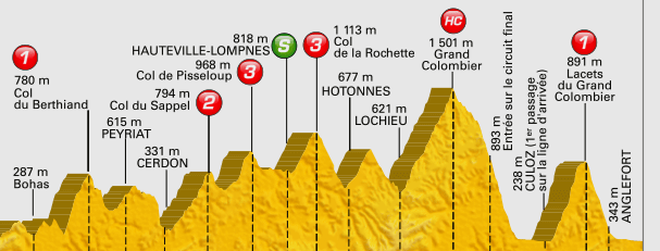
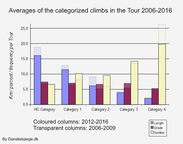
This table contains the same climb categories as above. But next to the three parameters length, grade and frequency, there are two columns with comparisons. The first compares the 2016 numbers with the numbers from the Tour last year. So the number "-4.6" in the third row means that the average length of the HC climbs in 2016 is 4.6 kilometres lower than in 2015. In the next column, we see that the length of the HC climbs in 2016 is 3.0 kilometres lower than the average of the Tours 2012-2016. The same principle goes for the two other parameters grade and frequency. Where 2016 differs The underlined numbers are the 2016-results that are the most remarkable. They differ significantly from both 2015 and 2012-2016: · The HC climbs are 13.1 kilometres in average, thus 26% shorter than in 2015 and 19% shorter than in 2012-2016 · The Category 3 climbs have a slope of 5.4% in average which is 17% less than in 2015 and 23% less than in 2012-2016 · There are 14 Category 1 climbs in 2016 - that's twice as many as in 2015 and 37% more than in 2012-2016 · In 2016, there are only 7 Category 2 climbs, so that's a reduction of 42% compared to 2015 and 27% compared to 2012-2016 · The number of Category 4 climbs has decreased by 14% compared to last year and 9% compared to 2012-2016 How do these differences affect the race of 2016? That's a complex question, and I'm not going to analyze much on that here. But note how similar the HC and Category 1 climbs are. There are few very long climbs this year, but at the same time there is a significant number of climbs with a length of 10 to 15 kilometres. In other words, 2016 is an 'Alpe d'Huez year' rather than a 'Tourmalet year', and the riders who prefer the former to the latter may have hightened their expectations when they saw the presentation of the route. It's not possible to derive long term tendencies from just one edition of Tour de France. After all, the data of the different climbs rely a lot on the specific design of the stages and the entire route, and these things are often subject to pragmatic solutions and 'coincidence'. So to make out general changes in the categories - and maybe even in the way the routes are designed - it will be useful to include some 'old' data: data about the climbs of the Tour 2006-2009. (Yes, Danskebjerge.dk also gathered information from the Tours back then.) 241 more climbs are thus added to the analysis. Comparing two eras Take a look at the column graph below. It not only summarizes the properties of the defining parameters of the categories, but also shows the differences between the two periods, 2006-2009 and 2012-2016.
Studying the blue columns, two things are evident: Firstly, the length decreases significantly and steadily, as we move from the most diffult to the easier categories. Sure, we already addressed that issue, but this charts illustrates it so nicely. Secondly, you'll notice that the climbs have shortened. In particular, the transparent column sections on the top of the three first columns show that the lengths of the hardest categories were bigger in 2006-2009 than now. Getting steeper If we then jump to the purple columns, the opposite development has taken place: While we saw the length going down, the slope of the climbs has gone up. More in some categories than in others, but still significantly - and enough to conclude this: The categorized climbs of the Tour de France have not only become shorter, they have also become steeper, - and both changes have happened within the last decade. This shorter-and-steeper tendency seems to indicate that the modern Tour favors the more aggressive climbers rather than the durable. And that the organizers prefer a more "explosive" race. This development is seen in the other Grand Tours as well. In fact, the Tour de France organizers may have been influenced by the Giro and the Vuelta when it comes to steep spectacular mountains. Category 2: A misfit One odd phenomenon needs to be addressed. That's the so-called Category 2 problem mentioned earlier. In the column chart it is easy to see. Start by looking at the yellow columns, those showing frequency. Had it not been for Category 2, there would have been an increasing number of climbs per category going from HC to Category 4. Instead, there are less Category 2 climbs than Category 1 climbs. And now look at the steepness, the purple column: We would expect Category 2 climbs to be slightly steeper than Category 3's, but they are not. Note that this irregularity is seen in both periods. As pointed out in earlier analyses about Tour de France climbs, Category 2 seems to be "caught in the middle", struggling to define itself. Some years, the organizers apparently try to revitalize this poor category, but Tours with many Category 2's remain rare, and the 2016 edition does no good in that respect, as only 7 Category 2 climbs appear here. Are there simply too many categories? Well, it would make sense to remove one of them. But then again: Things that are not so common tend to attract attention, and personally I like what's imperfect. Besides, the traditional category system is such an integrated part of the Tour de France (it is even used more and more in other stage races) that there is no going back. More: About Danskebjerge.dk 10 tough Danish climbs Records of the Danish landscape | |||||||||||||||||||||||||||||||||||||||||||||||||||||||||||||||||||||||||||||||||||||||||||||||||||||||||||||||||||||||||||||||||||||||||||||||||||||||||||||||||||||||||||||||||||||||||||